Introduction
Hello, and welcome to the Museum of Amusement Parks, or the M.A.P. as it might be called! For my Intro to Graphic Design class at the School of the Art Institute of Chicago, our goal for the length of the class was to create a brand identity for a museum of our choice. A proper museum to preserve amusement and theme park history has always been a dream of mine, so it seemed like a natural choice for the project. Thus, the M.A.P. was born!
Creating the Brand Identity
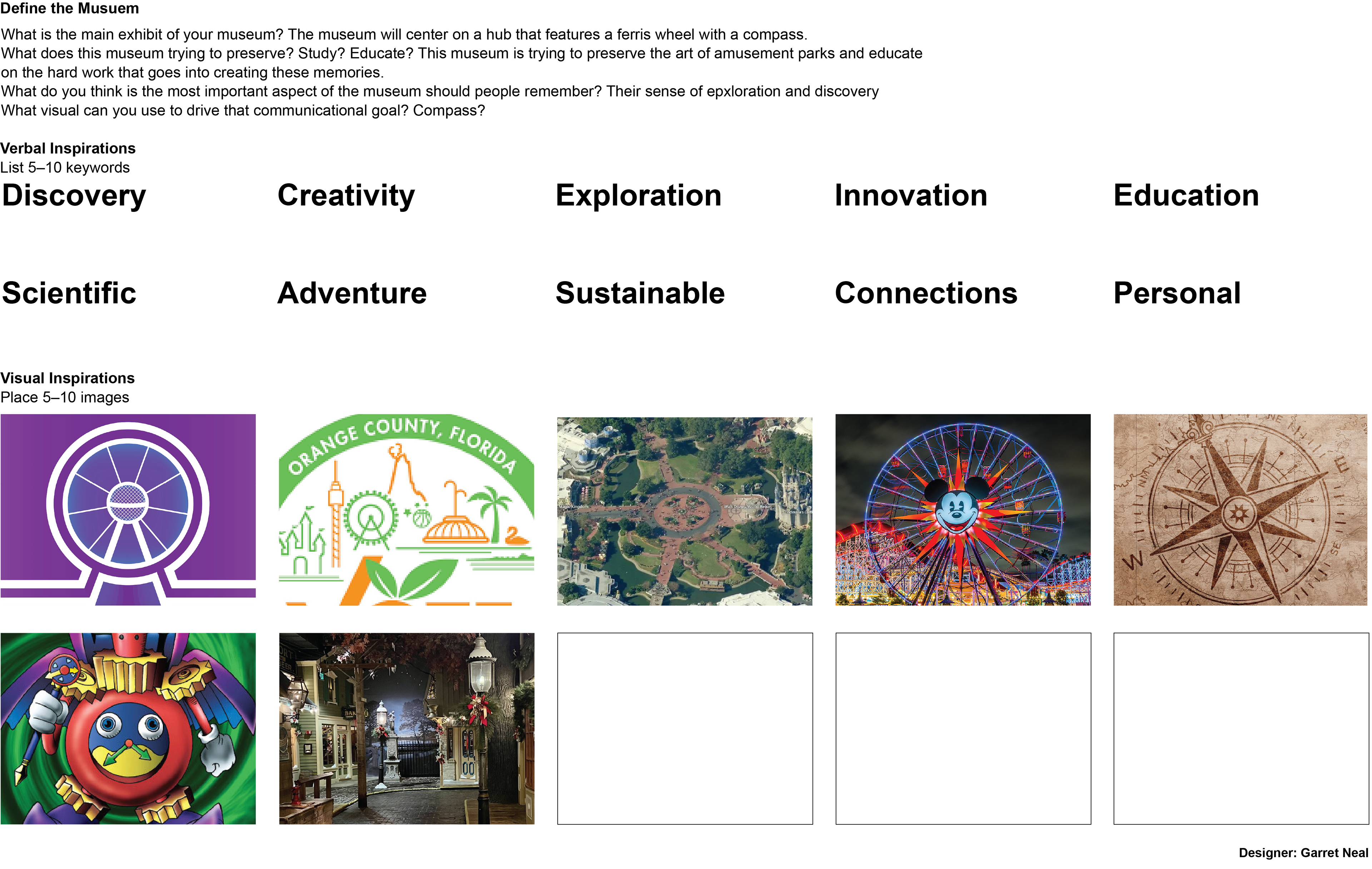
The first portion of the project was to craft the identity of the brand. Below is a page where I ideated on the meaning of my museum, what I wanted the imagery of the museum to convey to potential guests, and what inspirations I was drawing on for the look and feel of the museum. Due to the acronym of the museum being "M.A.P", I leaned into the ideas of exploration and discovery being key to imagery around the museum along with traditional amusement park imagery.
The Logo
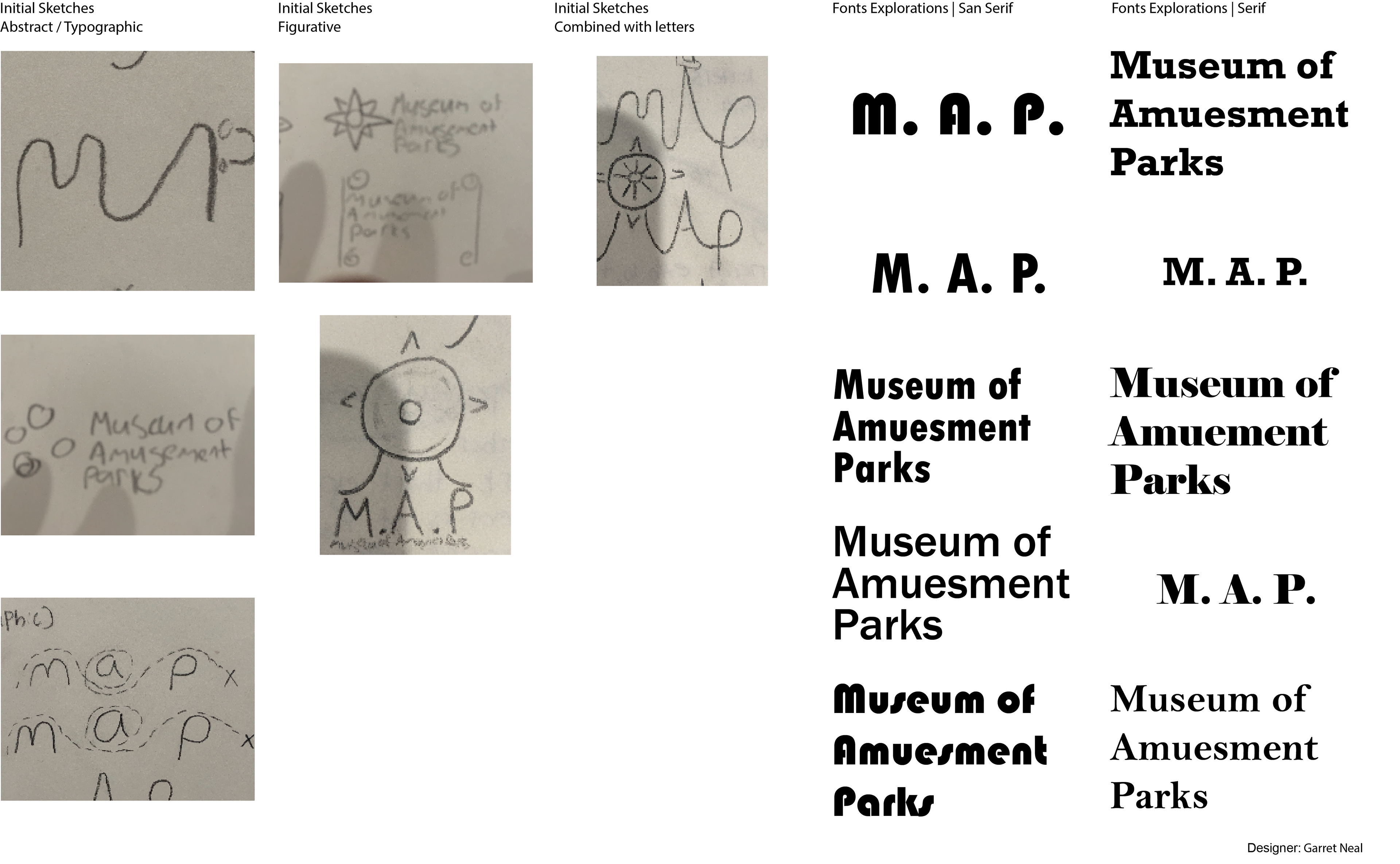
The first step in the project was to create the logo. As an anchor for the brand, it is important to get the logo right. After sketching out many different ideas, I settled on a handful they I liked. Each one had a different style, some more icon focused, some typographical, and others more abstract. I also began experimenting with font, trying to find one that had a bit of playfulness but still professional.
Typographic Logos
Abstract Style Logo
Iconographic Logo
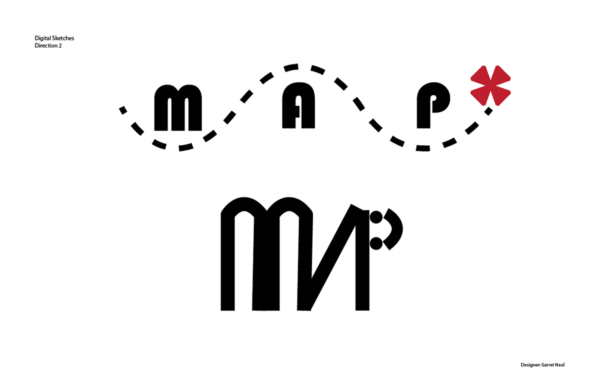
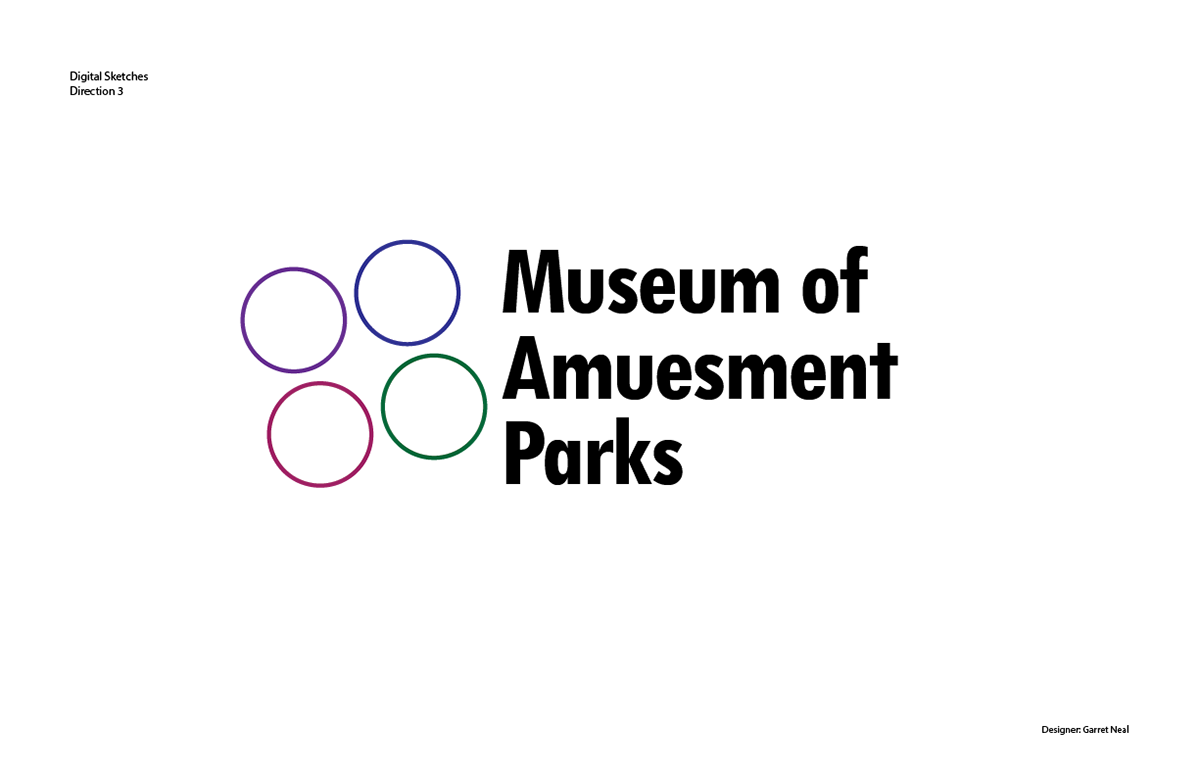
After going through the initial ideas in class, I selected the three I liked the most and explored those further. After more rounds of sketches, I took to the computer to build them digitally. I had two typographic logos. One featured the initials of the museum with a treasure map weaving through it. The other constructed the initials with lines to create the feeling of a roller coaster track, complete with a vehicle as the "p". I had one abstract logo, which featured four various colored circles representing the four quadrants of the museum.
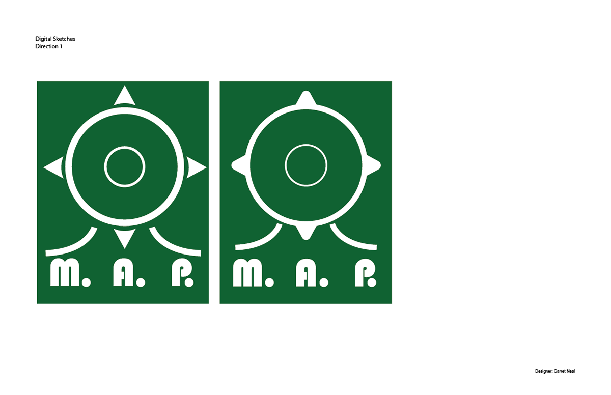
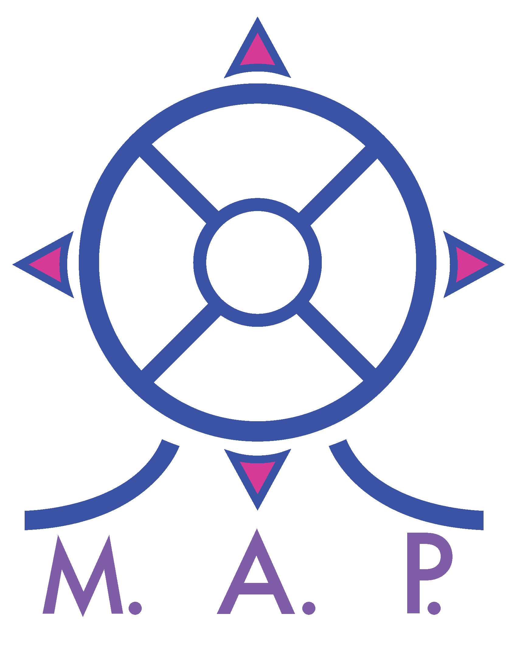
Finally, I had the iconographic logo. This one featured a compass styled Ferris wheel above the initials of the museum. I pictured a Ferris wheel with a compass rose on it as the centerpiece of the park, combining two very recognizable elements of amusement park and exploration imagery. Many existing parks feature an icon of some kind--be it a globe, castle, or flag--in their logos. So ultimately, I felt this was the strongest direction to go.
After testing out many different colors, styles, and types, below you can see different versions of my final logo for the Museum of Amusement Parks. I felt the imagery combined ideas discovery and amusement parks, the colors gave it a light and playful feel, while the minimal design and font gave it a professional tone.
Logo Usage
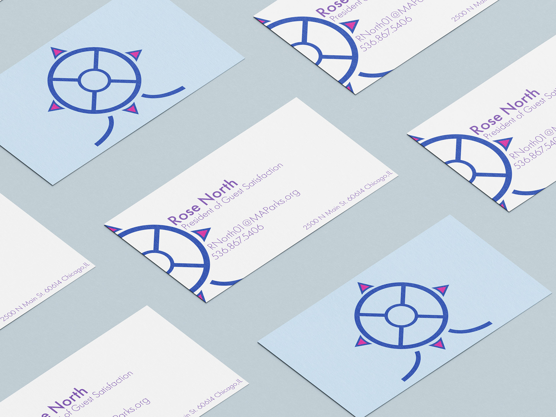
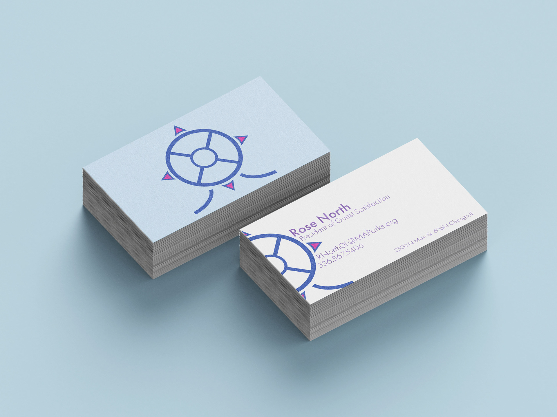
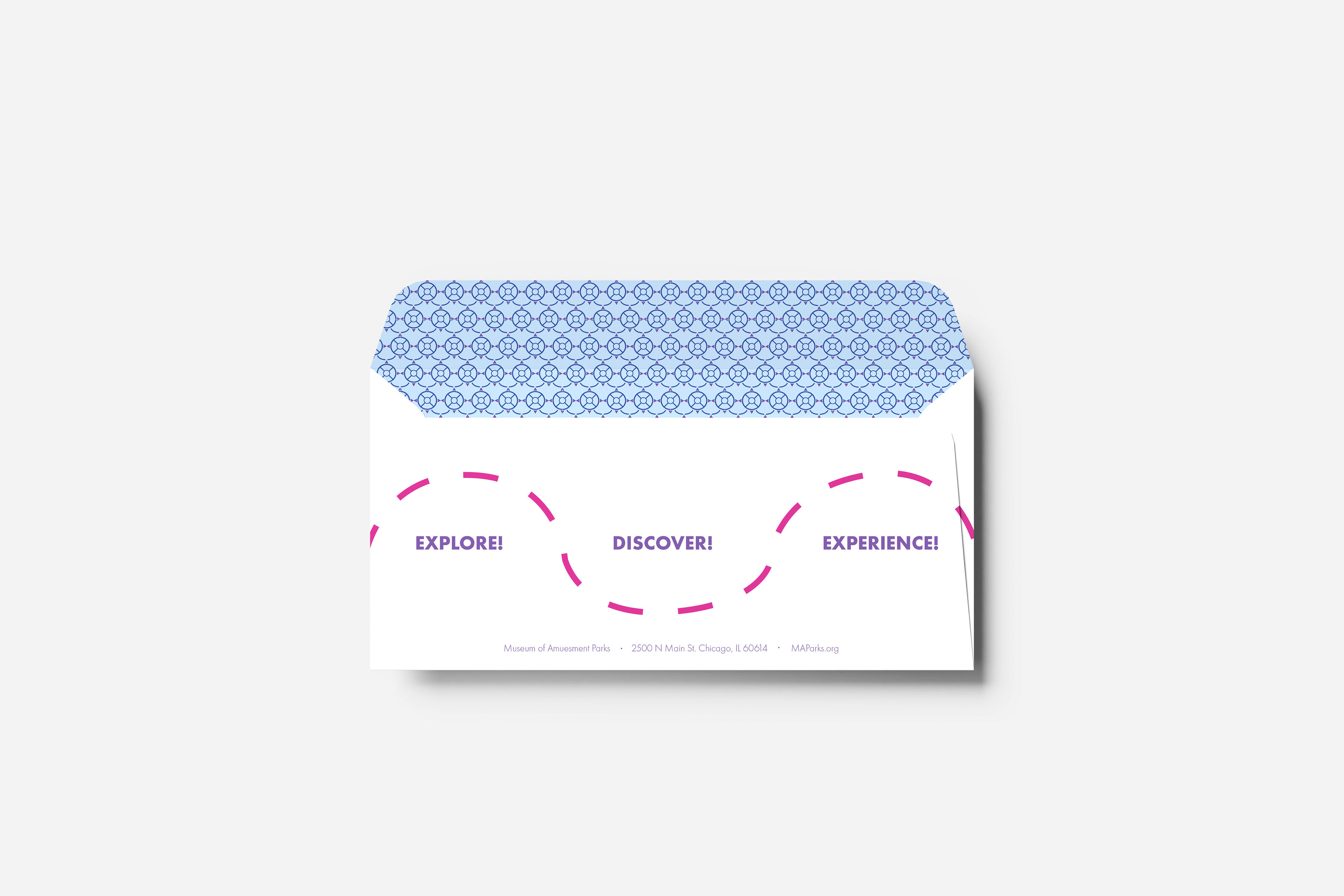
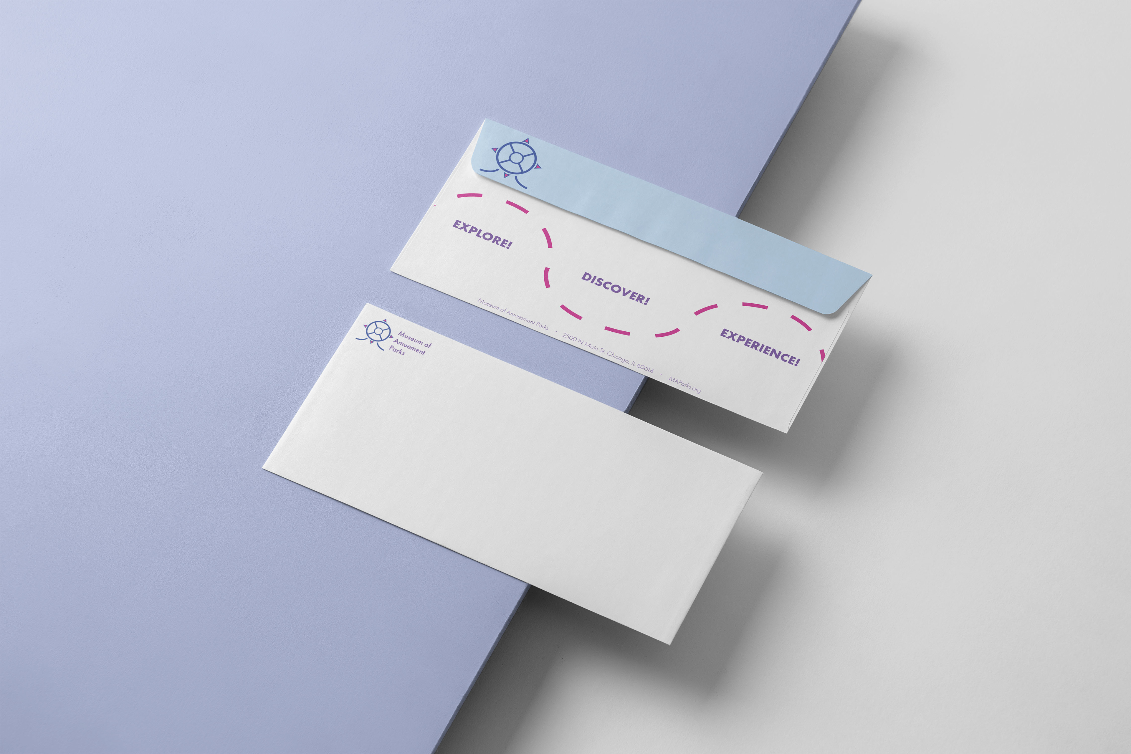
Once the logo was created, our next step was to show the logo in real scenarios like a business card and envelope. Below are the mockups of both! For the envelope I also brought back the treasure map idea from one of the logo sketches.
Postcard
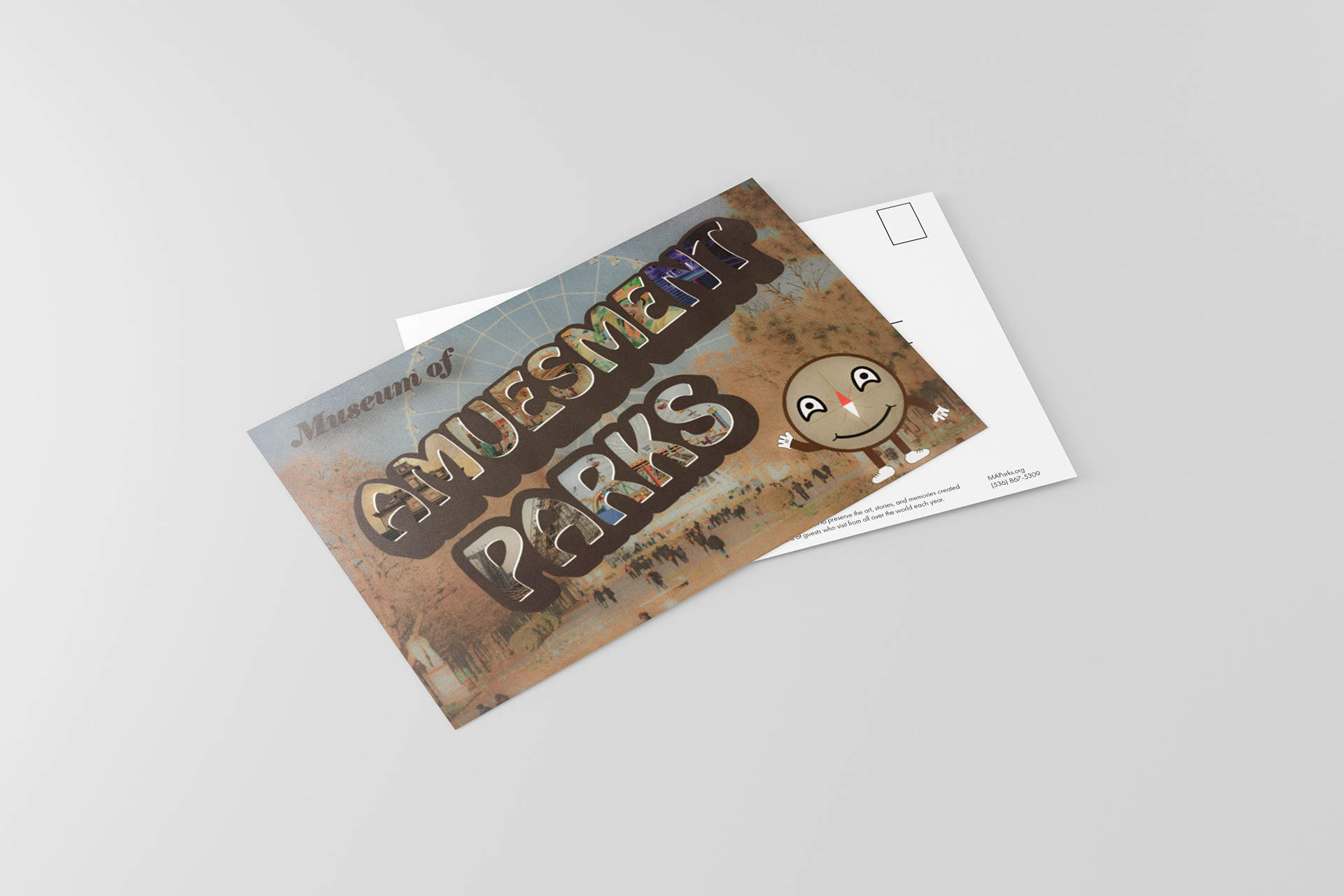
It then became time to flesh out the brand more through a postcard. This gave me a chance to start thinking more about what would lay inside the museum itself. It was also the opportunity to stretch my still growing photoshop skills.
I decided to go for the vibe of a vintage travel poster from the 60s. For that, I have stylized text of the name. Each letter in the name is filled with an attraction you might find at the park. Behind it is a picture of a Ferris wheel, which would hypothetically be the icon of the park. We also see the first appearance of Rosie! Rosie is the anthropomorphic compass rose I designed as the mascot for the museum. Costumed characters such as this are closely associated with amusement parks, so I felt like it made sense to have a mascot for the museum as well. Her design is simple, as it was not the focus of the project, but I think still effective.
Final Elements
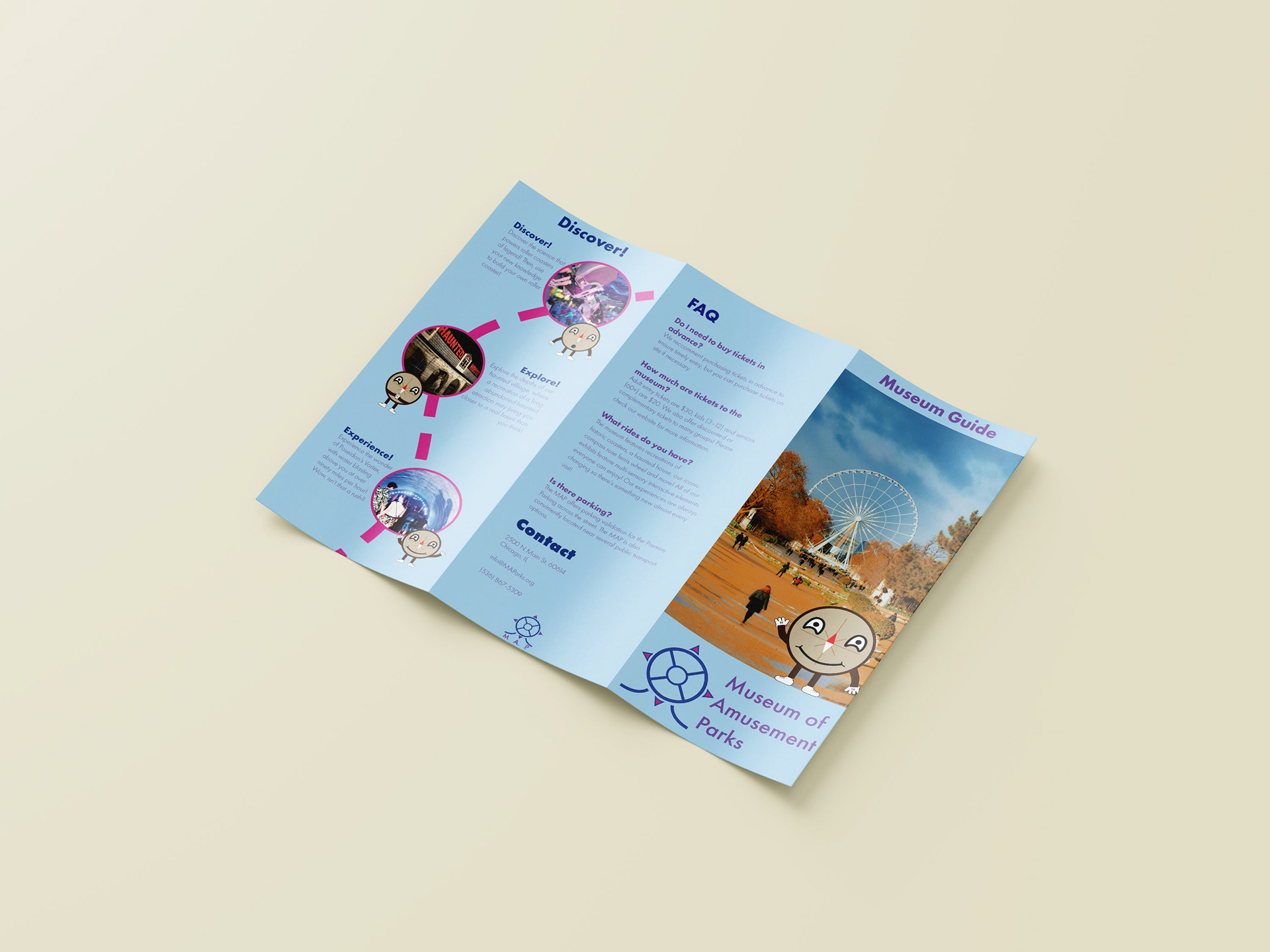
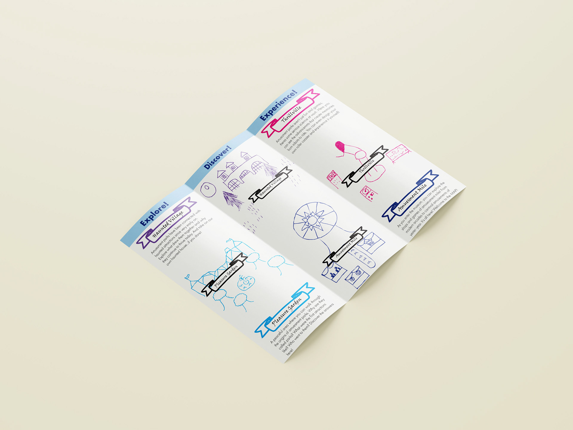
The final part of the project to bring everything together we designed a brochure. I based the layout of my brochure on that of the many brochures from museums and amusement parks I had access to. The front page is a simple welcome, featuring Rosie and the centerpiece Ferris wheel. The rear page is an FAQ page featuring basic information about the park, contact info, and some basic branding/legal information. The middle flap is a little more interesting, featuring a highlight of certain exhibits at the museum. It is titled "Discover!" which ties into a "Explore, Discover, Experience!" tag line I had been using. I also brought back the map trail imagery which I used on the envelope. Each highlight is paired with a reaction from Rosie, which I think makes the brochure more interesting for younger audiences and keeps here involved in the brand.
The inside layout is of course dedicated to the map. I decided that the museum would be divided into four main areas: A haunted area, a historic area, a future area, and an area dedicated to midway games. While not fully developed, it felt like a good starting point to get the map rolling. The map is an important part of any amusement park brochure, complete with the descriptions of the attractions there.
Due to time and my skill level at the time, my map illustration leaves a bit to be desired. However, I think many of the ideas present in the brochure and the brand itself are strong and I would love to revisit this at a later time!